Rehome
1. Overview
Rehome is a sub-brand of Adopt a Pet, designed to help pet owners find loving new homes for their pets when they can no longer care for them.
My goal was to make the rehoming process simple, supportive, and trustworthy for users during an emotionally difficult time—while strengthening one of Adopt a Pet’s key revenue channels.
Location: San Francisco, CA
Role: UX/UI Designer
Scope: Brand identity, UI design, & User Testing
2. Problem
Each year, about one-third of shelter animals—over 2.5 million—are surrendered by their owners. Many could have stayed in their homes with the right support. Those who try to rehome their pets often face unclear options, unreliable sources like Craigslist, and overwhelming emotions.
Rehome needed to provide a trustworthy, stress-free experience for owners while ensuring pets find safe, lasting homes.
Solutions
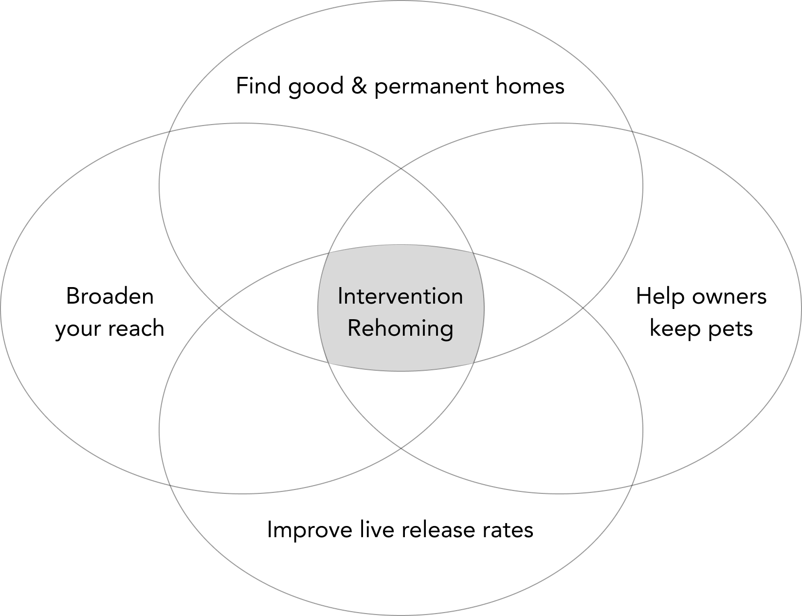
2. Objectives
Business Goal
Save lives by helping owners either keep their pets or find safe new homes.
Design Goal
Build a distinct yet cohesive sub-brand under Adopt a Pet
Improve navigation and clarity of CTAs
Create a calm, trustworthy, and supportive experience
Marketing Goal
Position Rehome as the go-to rehoming service
Increase adoption success rates and brand credibility
4. Discovery
Discovery Notes
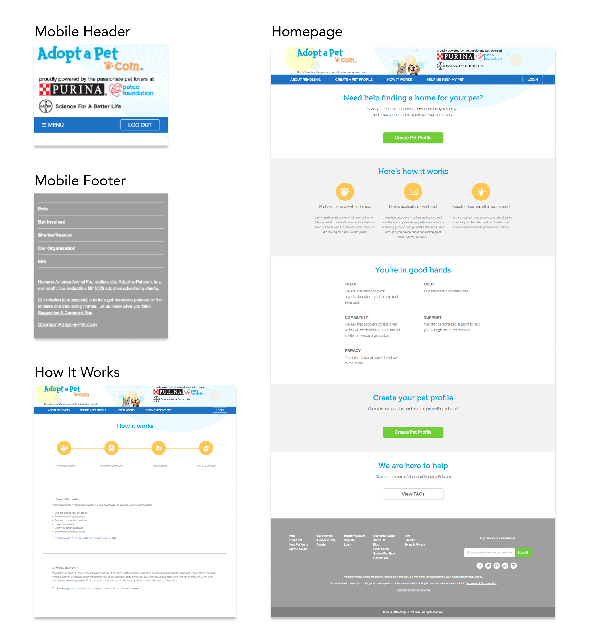
The existing “Adopt a Pet” header and footer on the Rehome website might be confusing to pet owner users who are looking to rehome their pets.
“Adopt a Pet” and “Rehome” brands coexist in the same space yet have incohesive UI elements
The “Getting Started” CTA button is crucial yet hardly visible or available across the site
UI lacked visual consistency and hierarchy
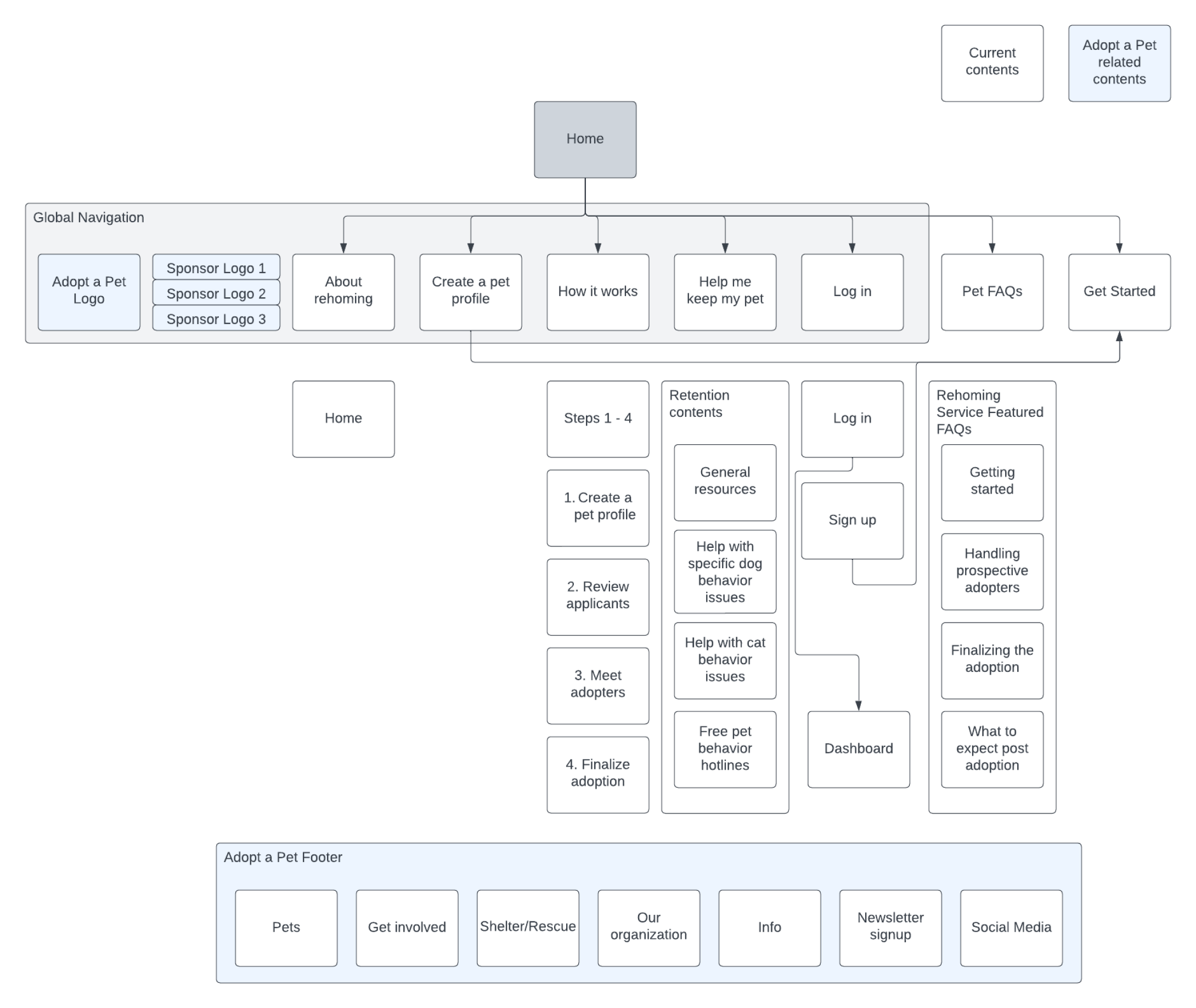
Information Architecture
Current IA
The header and footer for “Adopt a Pet” (mothership brand) coexist on the “Rehome” site
No link to Get Started (onboarding page) on the How It Works page, Help Me Keep My Pet page, and Pet FAQs page
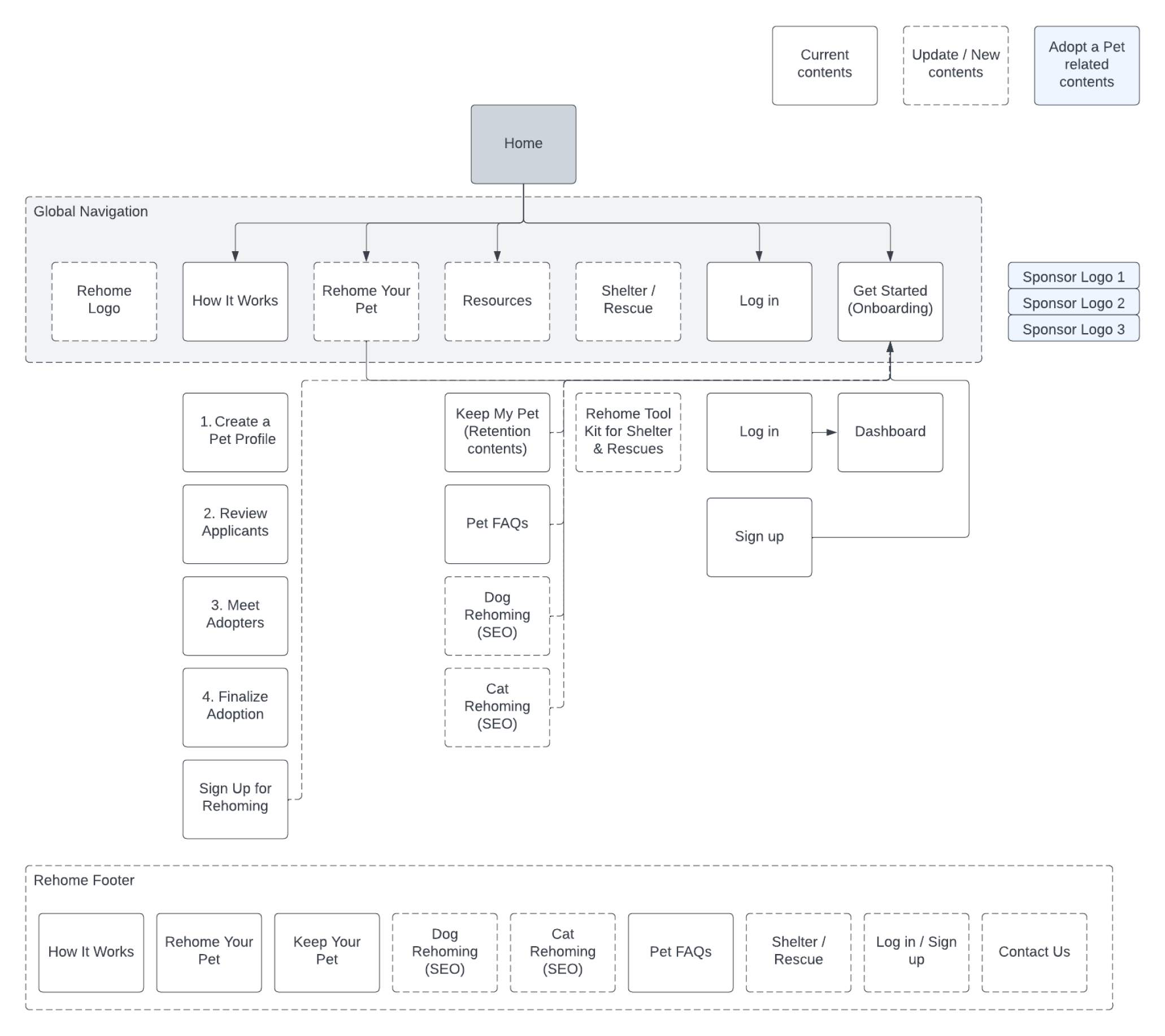
Proposal IA
Add the “Rehome” logo on the header
Clean up the footer with “Rehome” contents
Remove sponsor logos from the header
Created a dedicated ‘Resources’ section to organize educational content and improve SEO visibility
Rename“Create a Pet Profile” to “Rehome Your Pet”
“Help me keep my pet” to “Keep My Pet”
Add “Get Started” (onboarding page) links on the How It Works page, Keep My Pet, and Pet FAQs, SEO
5. Design Process
Brand Exploration
After identifying usability issues, I facilitated a brand workshop to align the team on tone and emotion. We defined six brand attributes — Trust, Delightful, Love, Simple, Comfort, and Fresh — to guide design decisions.
Based on the brand attributes, I presented three sets of design concepts with design strategies for the stakeholders. After the presentation, the team decided to go with the following design direction.
Concept: Journey to a Forever Home.
“We are your partner in finding a loving home for your pet.”
Emphasis on the well-being of your pet with its new family
Create a sense of comfort and support as we commit to be the guiding light in the entire process
Evoking a sense of/confidence in the fact that your pet can be supported, have its needs met, and feel comfortable, safe, and loved in a new home. He/she will be himself/herself
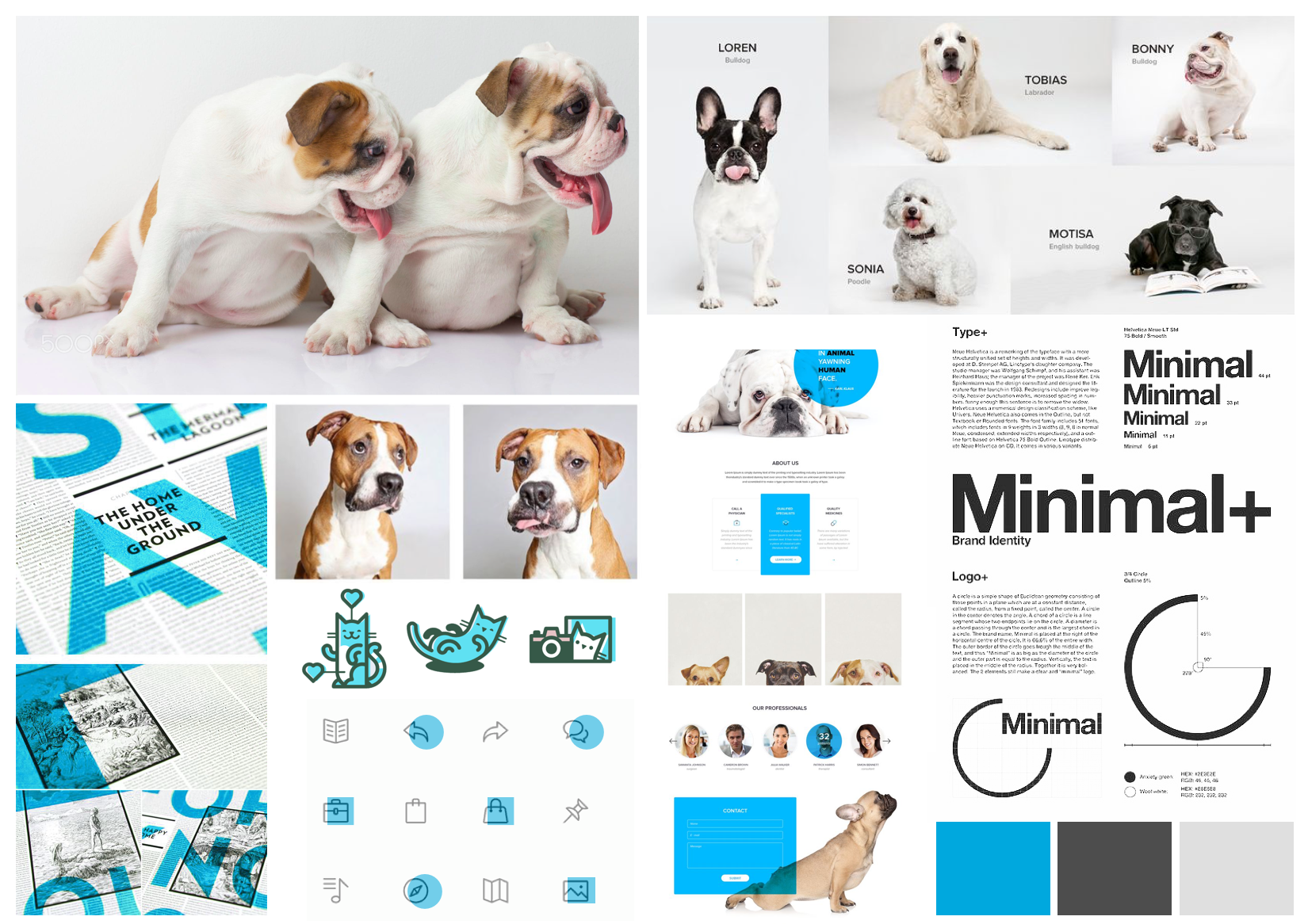
Moodboard
6. Design Solutions
To improve clarity and engagement, I proposed:
A new Rehome-specific header and footer
Unified brand identity consistent with Adopt a Pet but visually distinct
Consistent blue CTAs placed prominently across key pages
Modernized UI with pet imagery, whitespace, and calming colors
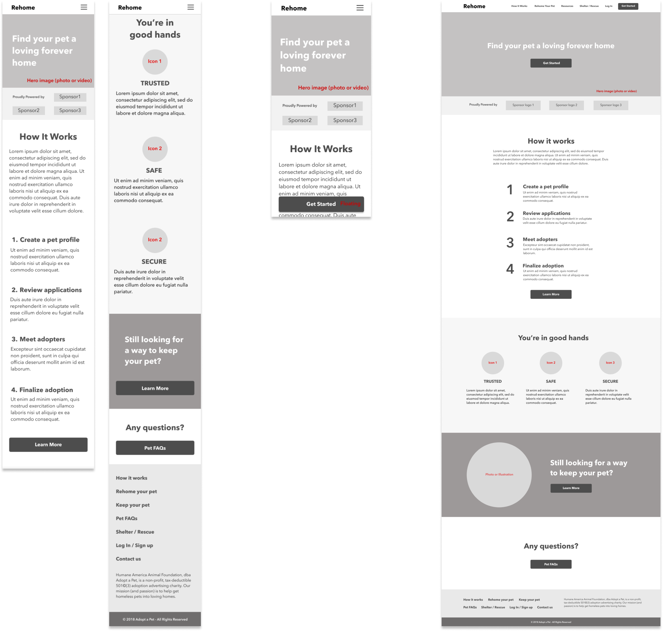
Wireframes
7. Final Deliverables
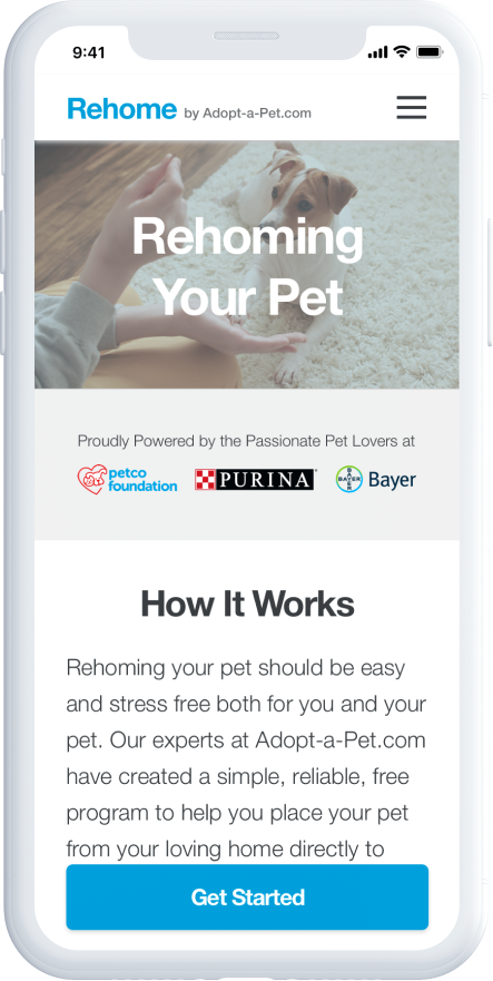
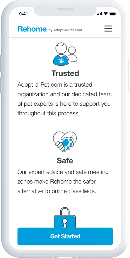
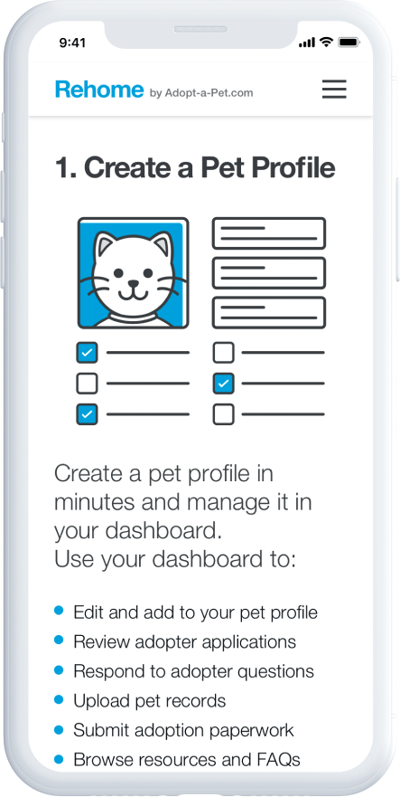
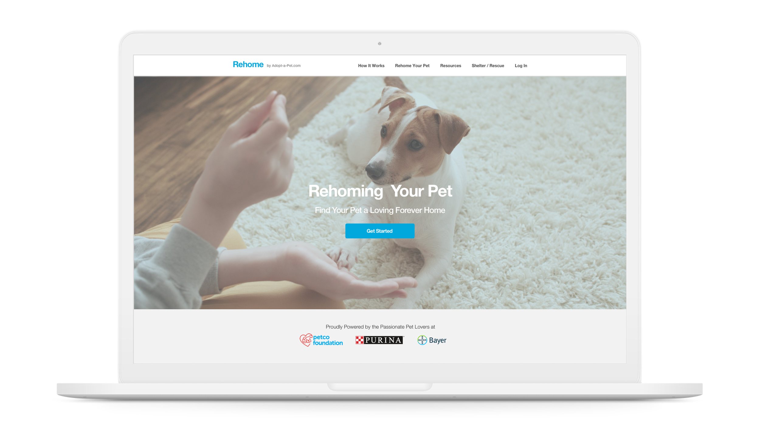
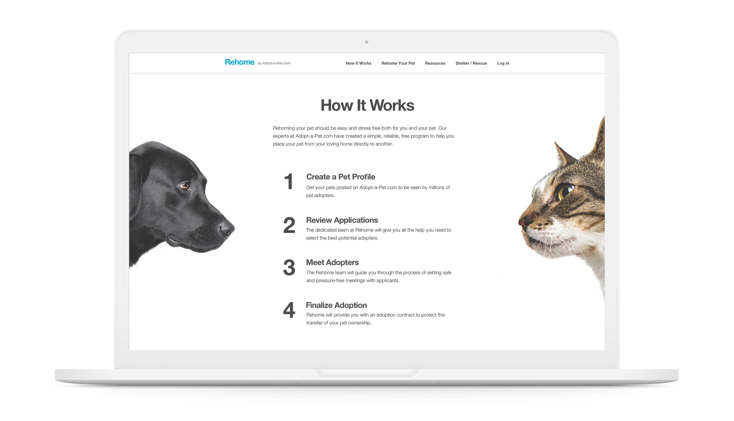
Mobile Mockups
Desktop Mockups
8. Testing & Optimization
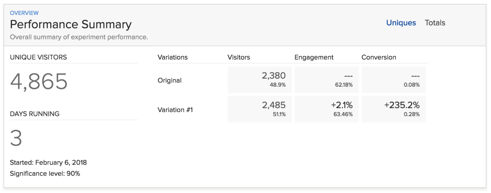
To validate design decisions, I conducted A/B and multivariate tests using Optimizely and AB Tasty between February and June 2018.
One key experiment tested different CTA button colors to improve user engagement.
Variation #1 (a blue CTA, consistent with the site’s color system) significantly outperformed the original design — increasing engagement by 2.1% and boosting the conversion rate by 235%.
These results confirmed that consistent visual hierarchy and color usage can have a major impact on user behavior and overall adoption success.
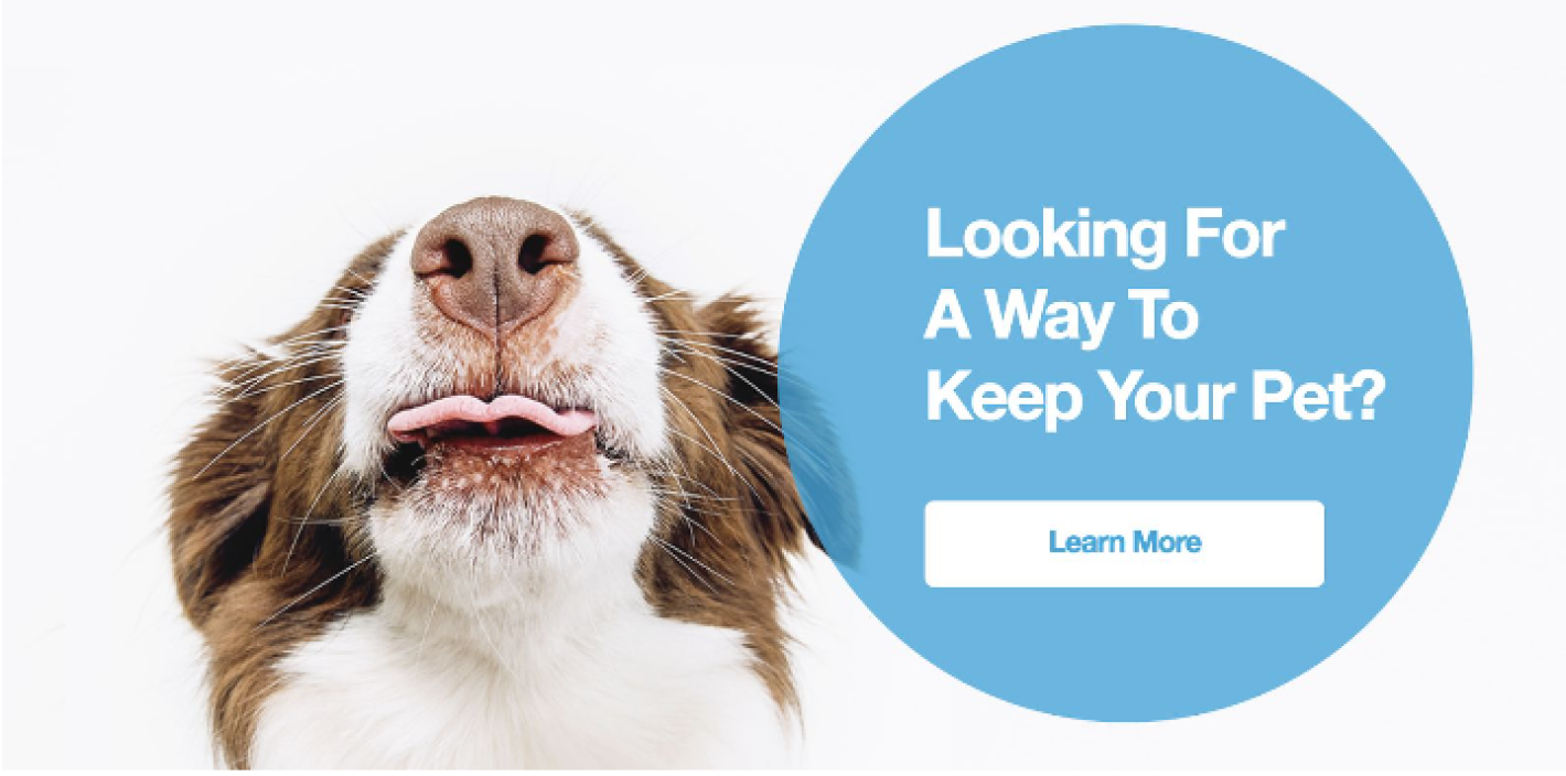
Test Example
Changing bubble and CTA colors
Variations
Original (Control)
Variation #1 Winner
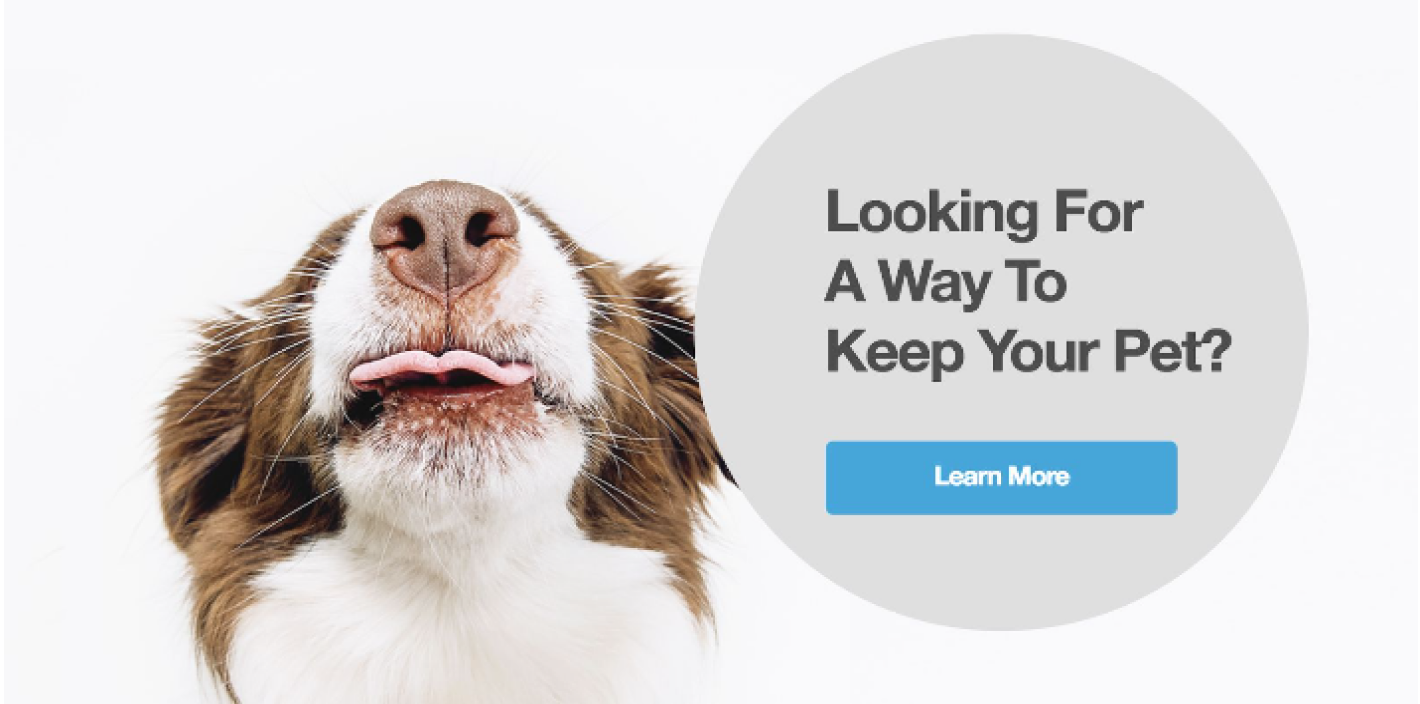
Hypothesis
I predict placing the current blue CTA button style for this UI will lead to an increase in clicks as we are consistently using blue CTA color.
Summary
The A/B test ran from Feb 6, 2018, until Feb 9, 2018, with a total of 4865 users participating.
Results
The engagement of variation #1 was increased by 2.10% and the conversion rate was increased by 235.20%.